Monday, 9 November 2009

Fruit - Lighting Techniques

For part of the systems and processes brief we have to take pictures of a fruit using different lighting techniques, i decided i wanted to make it a little more interesting rather than just pictures of fruit, so.. inspired by my Little Apple Dolls i used an apple and stuck pins in it, i was originally going to use nails but only had pins at the time, but they work just as well. I'm going to redo this idea for the objects brief and incorporate it into a set, which helps since i've now tried different lighting so i know which works best.


High Key

Low Key


45°/45°

 Backlight

Top Light


This is another version of the Backlit image which i have edited in Photoshop, i decided to add a scratch texture (which you can find here) to add atmosphere. I think this image has a sort of Tim Burton feel!

Sunday, 8 November 2009

Fortnightly Picture Project - #1 Reflection

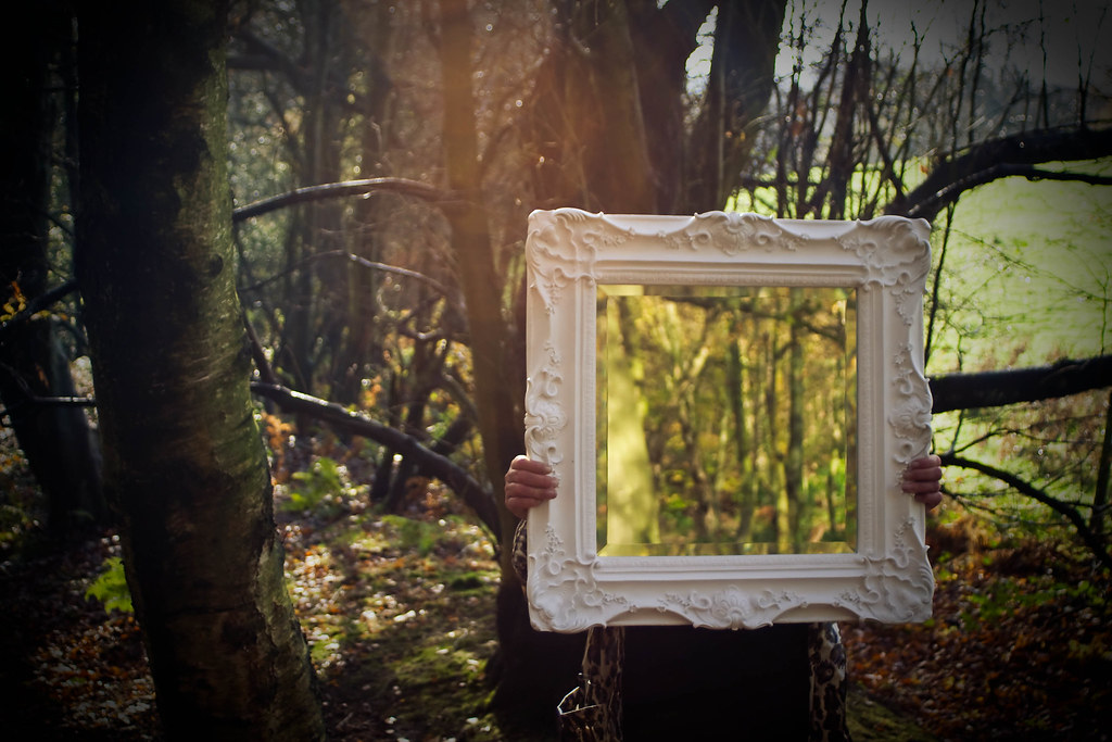
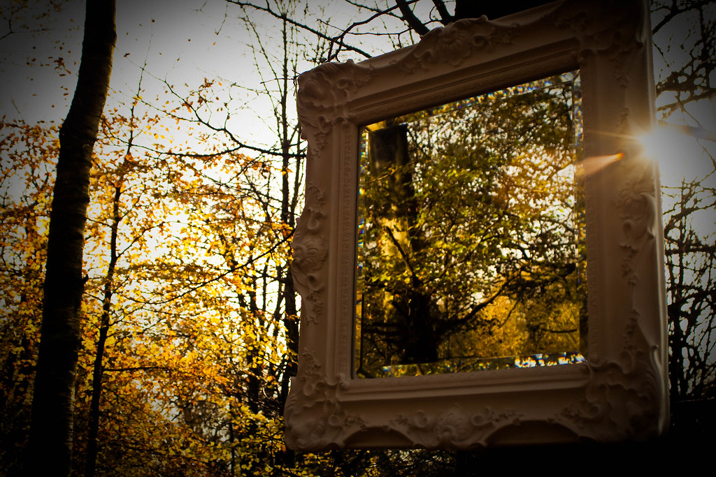
I decided i wanted to take a fancy looking mirror and put it somewhere completely out of context, after drawing up a few sketches i thought i'd shoot some with someone holding the mirror, to add to the sense of surrealism - it also works as a sort of mask or disguise.. and even camouflages the person. I was originally going to shoot this with a massive contrast between the reflection and the background - say stood on one side of a street that looks really posh reflecting the otherside of a street that looks rundown (there are alot of streets in Blackburn that look like this! haha) but i decided to shoot in the woods to add more of a camouflage effect rather than making it more conceptual and complicated. Here are some sketches i made when drafting ideas:


And here are the images i took:

This is the image i chose to use as my final image, i had a really hard time choosing between the four images but chose this since its the closest to what i had in mind.


Sunday, 1 November 2009

Cold, Warm and Grey Balanced - Adobe Lightroom

Open your chosen photo in develop (by selecting it and then clicking on the develop tab) which should bring up a screen that looks like this:
 

This is the original image straight from the camera. I think that this image is a little warm, so first i will demonstrate how to 'grey balance' a photo in Lightroom.

Select the white balance selector tool (quick key - W), if you hover this around the image you will see a box come up that says 'pick a target neutral', you will also see the white balance of the preview image change (under the navigator)
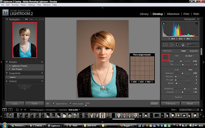


I have highlighted the preview image and where the white balance selector tool is situated in red. I decided to use a colour sample from the background, i feel these are the most neutral colours and if you look at the preview image to the left you can see the white balance in the image looks less warm.
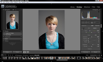

After using the white balance selector tool i adjusted the sliders slightly and now i have my 'grey balanced' or colour corrected version of the image.


Now that i have a corrected version of the image it should make it easier to make a cold and warm image using the temperature slider.
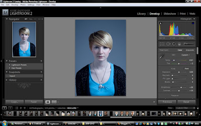

By dragging the temperature slider slightly to the left (to the blue side) you end up with a colder image.
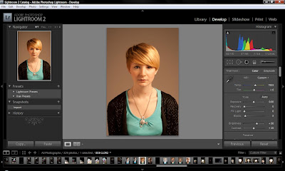

 
And by dragging the slider slightly to the right you should end up with a warmer image.


Here are the images:
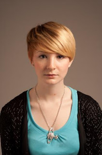

Original


 Color corrected/Grey Balanced
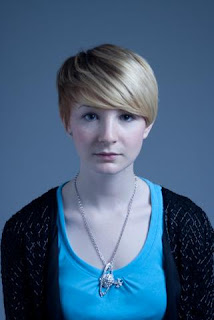

Cold
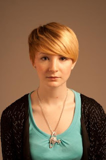

Warm


Friday, 23 October 2009

Little Apple Dolls - Scratch Experiment

I decided to experiment with creating scratch textures in the darkroom - using plastic wallets with various different scratches and placing them over the photo paper during the exposure. I got this idea after reading about how Joel-Peter Witkin places glass on top of his prints and paints over it with coffee and various other things - i want to try this aswell at some point - but doing scratches this way saves doing it directly onto your negatives and possibly ruining them. These are all shot with a Kodak No.2 Autographic Brownie, using a light tent cube and two continuous lights with 5500k daylight bulbs - same as the previous post i made with the digital images.

This is the straight print.

These scratches were done by scratching into the plastic using just scissors - i think these are far too noticeable and distract away from the actual picture.

This was done using sandpaper, the plastic i used for this had a slight texture too, i like texture this makes overall - although they dont look like 'natural' scratches.


This was done using a mixture of both of the above - clear plastic this time with sandpaper, and a few scissor scratches. This is better but i feel i would like it more if it was a bit more subtle still.

This is my favorite of the bunch - i accidentally over-sandpapered a sheet of plastic and it all ripped in the middle. I had a go to see what it'd look like anyway and i love the 'crack' effect it makes. Happy accidents are great!

I think i need to figure out a way to get more subtle scratches, i think i went a little over the top, but for a first try i think they turned out pretty good!