Sunday 1 August 2010

Oh Deer!


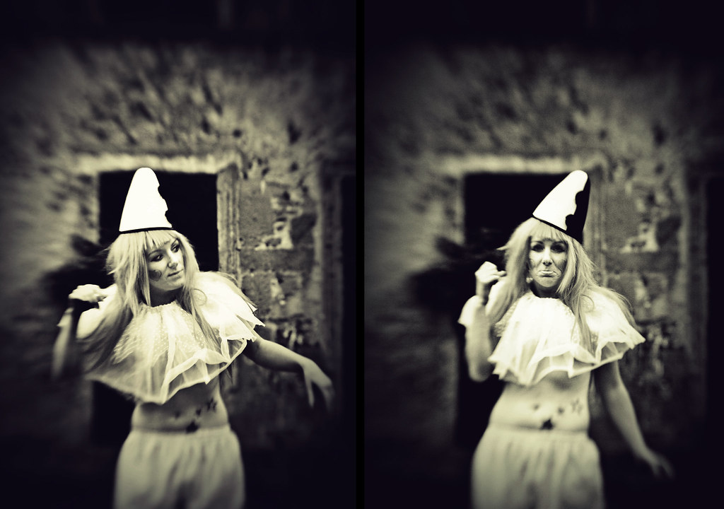
Model - Bam Bam Blue
Make-up - Alice Birchmore
Clothing - Lovechild Boudoir
Antlers - Ian Radmore


Monday 28 June 2010

Night at the hospital


Models - Dollywood & Rudigo
MUA - Alice Birchmore


Tuesday 15 June 2010

Clowning Around


Me, Donna, Hazel and Mia (Donnas daughter) went for a little trip down to old Feniscowles hall, near Blackburn. I modelled for Donna and Hazel modelled for me. 

Here are some of the photo's i took:


Monday 24 May 2010

Evaluations – The Human Condition


Evaluations – The Human Condition
For this project I decided I wanted to make a set of images to present, after a lot of thinking I came up with the idea of doing various mental and personality disorders. This idea lead me straight to look at Emilie Autumns’ “The Asylum for Wayward Victorian Girls,” specifically her drawings of leeches and their various mental disorders, I liked the way she had portrayed them almost abstract, rather than the obvious. My first approach to photographing my idea was going to be very surreal and abstract – as if the feelings of the person were displayed outside of them, but I couldn’t quite work out how to do it. After a while my idea developed into more literal representations of the various disorders, and almost cliché. I decided I would present it as a documentation from and old Victorian asylum, as an almost catalogue of the insanity. As it was supposed to be Victorian I think the cliché approach works because it’s supposed to be through the eyes of a Victorian – how they would portray “mad girls.” As a society that generally shunned anything that wasn’t the social norm, and if you were a woman especially, anything could get you locked up in an asylum. I suspect there may have been some males who had quite a fetish for the mad girl, and in that way this book could be seen as a book that was meant to sell the girls – though this is not what I was going for.
          I decided to portray four disorders; Insomnia, Nymphomania, Bulimia Nervosa and Multiple Personality Disorder.
          For insomnia I decided to highlight the use of clocks, and purchased a huge clock to use as a prop. I think clocks are significant if you have insomnia because when you’re trying to get to sleep and know you have to wake up early in the morning it can be torture listening to the clock ticking away. I got in touch with a make-up artist and explained my concept to her and we came up with massive bed hair, and dark circles around the eyes. I took inspiration from Emilie Autumn’s song ‘4 o’clock’ and the model I used came up with an outfit which was made up of a corset, frilly knickers and stockings. She managed to incorporate a large pocket watch attached to the corset which was set to 4 o’clock (the large clock was also set to 4) The final images I chose where both using the lensbaby; one of them is a picture of her standing there looking quite dazed and sleepy, and the other is a picture of her holding the clock. I think these images works well together as they are both very similar with the one difference being the clock prop. I think the way she’s holding the clock in the 2nd image signifies the importance of time.
          For Nymphomania I didn’t want to go down the sleazy route, and the disorder isn’t exactly nymphomania, she’s just a wayward seductress and a general menace to society who can’t help but take her clothes off all the time. She often tries to seduce the guards. Rather than doing the obvious with this I wanted to go more down the burlesque route, as I think it’s more in keeping with the whole theme. I think the images turned out well and the model helped this a lot. In the first image she is showing a more mysterious pose, whereas the second is cheekier.
          For Bulimia I decided to get lots of cupcakes and a table and make it seem like a tea party, I wanted one image of her eating the cakes and the other image of her looking quite sick and displeased with herself, I think I achieved this. I don’t think these images really fit in with the others that well, I think this is because of the table – all of the other images are just simple portraits.
          For Multiple Personality Disorder I decided to portray the dark and light sides of her personality, this is mostly shown in the outfits, but the model did a very good job with posing and played both roles very well. The light image is supposed to look very angelic and she’s holding a book that’s supposed to be the bible, in contrast the dark image is a bit gothic and her expression looks a bit vindictive. I think the outfits work very well as they are both quite similar yet in opposite colours.
          I decided to present my images in an old Victorian cartes de visite album – in keeping with the theme, although the book may be a little small it works perfectly. I have presented the images in two’s and included quotes and a very small ‘admittance sheet’ stating the name, age, sex, form of insanity, if they’re suicidal and if they’re dangerous to other or property. As my images were meant as a set, I used a Lensbaby and the same lighting – butterfly lighting with a beauty dish and a honeycomb for backlighting for every image. In post production I also edited all the images the same, I made a sepia action that still kept a hint of colour, with a vignette, and I later added a texture overlay to add to the vintage feel. For the most part, I think my images turned out well and are not as cliché or obvious as I first suspected they would be.
          Overall I think the book works very well as a set and I have done a good job in creating images that fit with each other.

Corporate Portrait


Sunday 23 May 2010

Evaluations – Places

Evaluations – Places
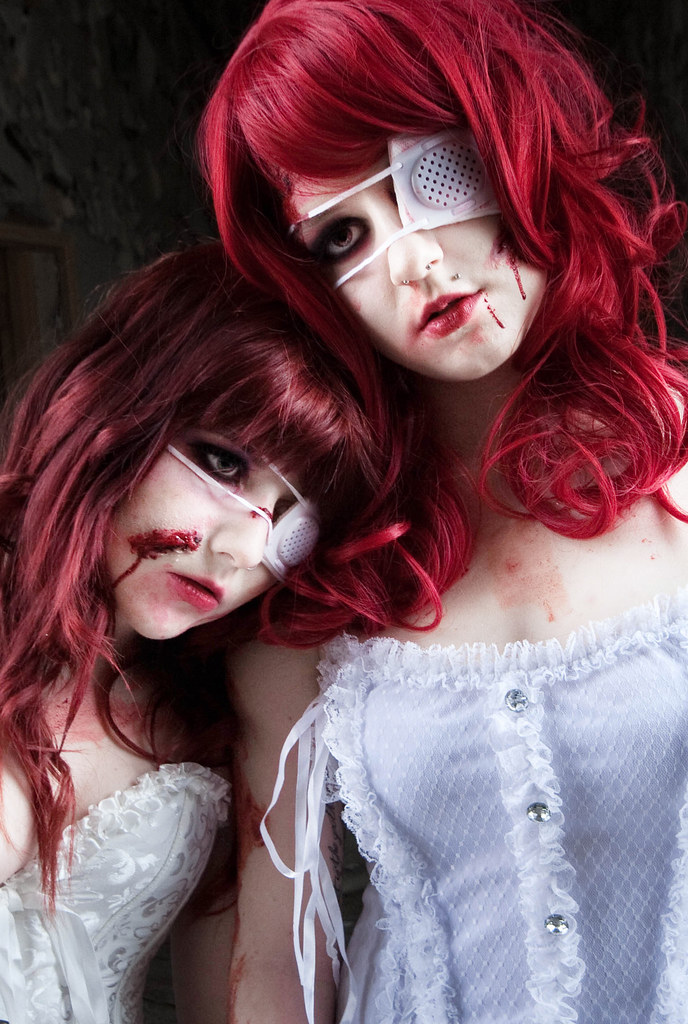
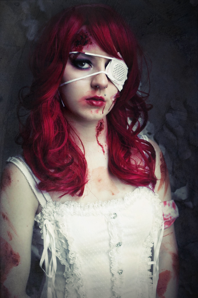
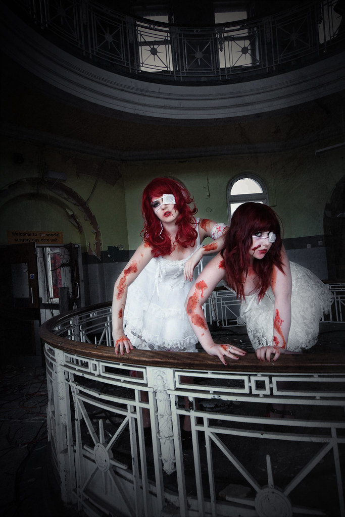
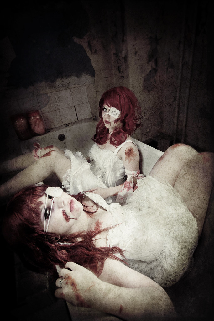
For the places brief I started off with no concept at all and couldn’t find any inspiration. I decided to start by doing some wilderness/countryside images as this is the genre that’s most accessible to me. They didn’t turn out very exciting. I decided to have a go at the significant places, as I had a solid idea of what I wanted to do, I went to the street where I grew up and shot a roll of film using my Holga 120 GCFN. I planned on cross processing these images as I wanted them to have the feel of childhood memories, unfortunately this didn’t work and my negatives turned out black – apparently the chemicals had been left open for a while. Next, I had a short trip to the now abandoned Blackburn Royal Infirmary for the alien/foreign part of the brief, we only explored the bottom floor as we couldn’t find the stairs and it was very dark so I had to use a high ISO which made my images rather grainy, this prompted a second visit a few weeks later when we were more organised and well equipped. We managed to make it to the above floors and it was really worth it. I used a Sigma 10-20mm lens for these images as I think the wide angle distortion works really well for this genre. I then revisited the street where I grew up with my Holga once again and got all the images I wanted, this time I processed them normally in C-41 and they all turned out perfect. Next on the list was Urban or City Sprawl, I decided to shoot this around the area I live because I live in an urban area and I think it represents an urban area well – half of the houses are boarded up and derelict and half are perfect, which illustrates most urban areas – old out of date houses being closed and demolished to make way for more modern housing. The area I live in is mostly council houses and I think my photos represent this.
For my presentation of the images I decided to present my significant places images as a set because none of the images out of the 4 sets worked well enough together to present them together – they were all different shapes, formats and colours. I had enough images and a wide enough variation to present significant places as a set. I presented 15 images in a square book. We were told we could either present two of each category or eight as a set. I wanted the book to describe my childhood memories so I chose a childish font to go alongside some of the images.
Overall I think this project has been okay, although I could’ve put a lot more effort into it – I will admit places photography is not my strong point. I think the images I have come up with are technically good but I don’t find many of them very interesting, this is just my personal preference though.

Thursday 20 May 2010

The Human Condition - Presentation


Saturday 15 May 2010

City/Urban Sprawl

For this section of the brief i decided to take pictures of the area of gallegrieves, it was a very sunny day, which created lots of nice long shadows. I used my Sigma 10-20mm lens, and edited the images in Adobe Lightroom.


ISO: 100, f/16, 1/60sec

ISO: 100, f/14, 1/80sec

ISO: 100, f/14, 1/100sec

ISO: 100, f/14, 1/100sec

ISO: 100, f/14, 1/100sec

ISO: 100, f/14, 1/100sec
ISO: 100, f/7.1, 1/250sec
ISO: 100, f/7.1, 1/400sec
ISO: 100, f/7.1, 1/500sec

ISO: 100, f/7.1, 1/500sec


Contact Sheets: