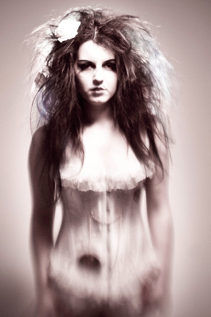
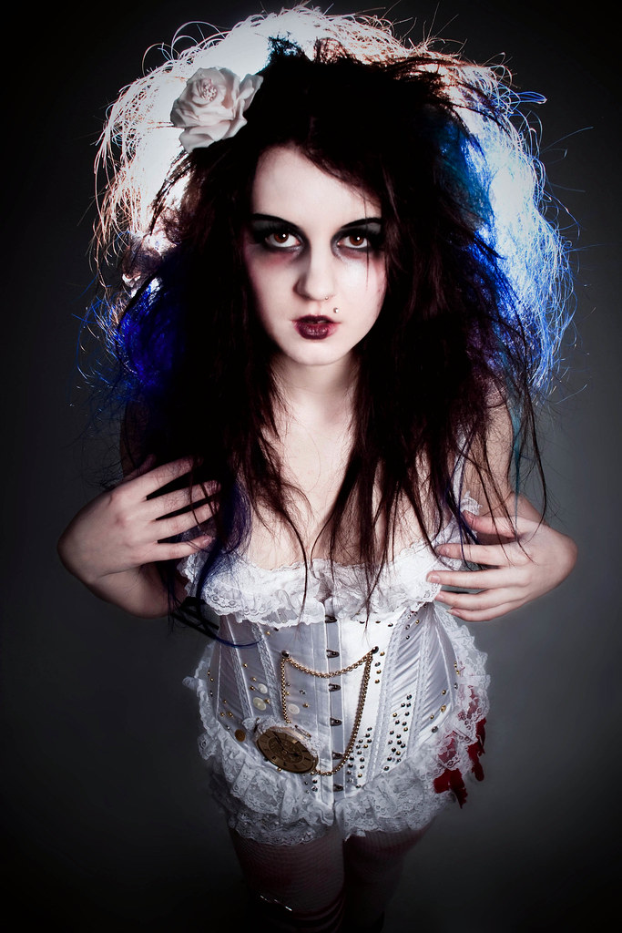
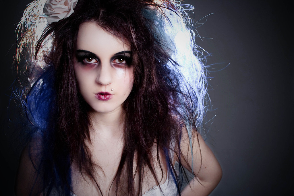
These images are for part of the human condition brief, i decided to produce my images as a set with a concept.. you can see my basic idea here. The concept for these images was insomnia, so for the styling i decided on big, messy hair, and quite 'tired-looking' makeup, with dark circles under the eyes. I took inspiration from Emilie Autumn's song 4 o'clock ~
"4 o'Clock
4 o'Clock
Never let me sleep
I close my eyes and pray
For the garish light of day
Like a frightened child I run
From the sleep that never comes
4 o'Clock
4 o'Clock
Out of bed I creep
To climb this tower of shame
But the hour's still the same
Only madness knows my name
At 4 o'Clock
Why can we never go back to bed?
Whose is the voice ringing in my head?
Where is the sense in these desperate dreams?
Why should I wake when I'm half past dead?
Sure as the clock keeps its steady chime
Weak as I walk to its steady rhyme
Ticking away from the ones we love
So many girls, so little time "
4 o'Clock
Never let me sleep
I close my eyes and pray
For the garish light of day
Like a frightened child I run
From the sleep that never comes
4 o'Clock
4 o'Clock
Out of bed I creep
To climb this tower of shame
But the hour's still the same
Only madness knows my name
At 4 o'Clock
Why can we never go back to bed?
Whose is the voice ringing in my head?
Where is the sense in these desperate dreams?
Why should I wake when I'm half past dead?
Sure as the clock keeps its steady chime
Weak as I walk to its steady rhyme
Ticking away from the ones we love
So many girls, so little time "
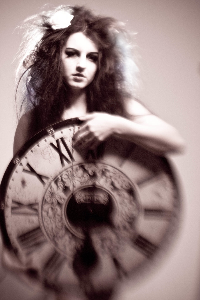
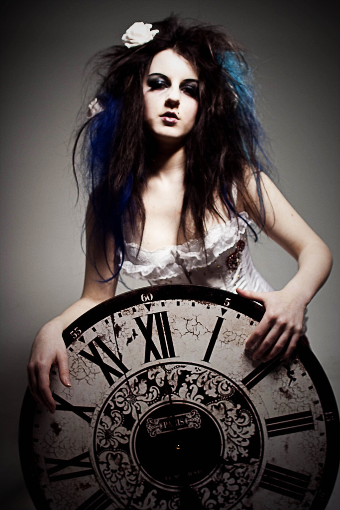
The song is actually about how people who are bipolar supposedly wake up at 4 o'clock, without fail. But i think the lyrics fit in with insomnia, especially the last two verses. As when i have insomnia, i often can't seem to stop thinking 'Whose is the voice ringing in my head?', and the sound of the clock seems to get louder (and very annoying) 'Sure as the clock keeps its steady chime'. I think insomnia has quite a big connection with time, especially when you know you have to be awake early in the morning.. listening to the clock tick away can be torture. So, what better to show this than to get a massive clock and set it to 4?
I did want to shoot some on black and white film so i could have a go at lith priting, but i don't have any film left and can't afford any more untill loan time!
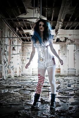
We shot half in the studio and half on location in an abandoned hospital.
These images were taken in the studio, Honeycomb pointing towards the models head (Backlighting) and a beauty dish pointing down (Butterfly Lighting). I used a Lensbaby Muse with a Plastic Optic for the soft, blurred effect and applied the 'Aged Photo' Preset in lightroom to add a more vintage look. I think if i present my photos in a vintage photo album i would use these.
These images were also taken in the studio, with the same lighting as above. This time i used a Sigma 24mm f/1.8 prime lens. I decided to keep these in colour because i think these ones suit it better.






0 comments:
Post a Comment